Using Interaction Maps to Design User Experiences: Part 2
What makes a good interaction map?
An interaction map should be able to answer the following questions. Will a user who comes to your site or online application be able to complete their task? What path will different users take through your site? Which use-case has the best experience and which one has the least optimal?
Remember that one of the main purposes of an interaction map is to keep the entire team, as well as the client, focused on the user's experience.
Simple is good
Each web page represented on an interaction map should only be as detailed as necessary for clarity. We’ve found that a very basic representation of the page is adequate. It is helpful to indicate any key requirement or control that may be on the page, such as a quantity control in a cart, a checkout button, or a login control. Especially important are those controls that might be up for discussion, or may affect other parts of the process. The beauty of the interaction map is that these controls are easily relocated, altered, and updated before the wireframe stage begins.
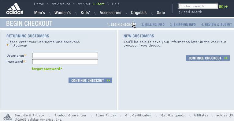
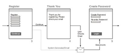 A simple login map with basic fields and buttons.
Each page should have a title as well as a number. Pages in complex flows can have an alphanumeric indicator (for example, page 3 in the registration process could be R3). Terminology often evolves during the design of an online process, so once a number is attached to a page, it should remain throughout the duration of the project. If the page name changes, or the page is relocated, the number acts as an id tag.
Only show pages that are pertinent to the process. If the user could enter into another process, indicate that with a loop symbol and show that process in a separate map.
The path leading from each page should be labeled with the function that enabled it. For example, the cart page may have two paths leading out of it: “Checkout” and “Continue Shopping."
Try to keep the map to a page size that will be readable when printed out at common sizes – letter, legal, or tabloid size. A map that's too big to display on one of these sizes might be better off broken into smaller chunks. We usually create interaction maps in vector programs like Freehand or Illustrator, and save them as Acrobat PDFs for distribution.
Double your fun
There are two main types of interaction maps: multiple-path and single-path.
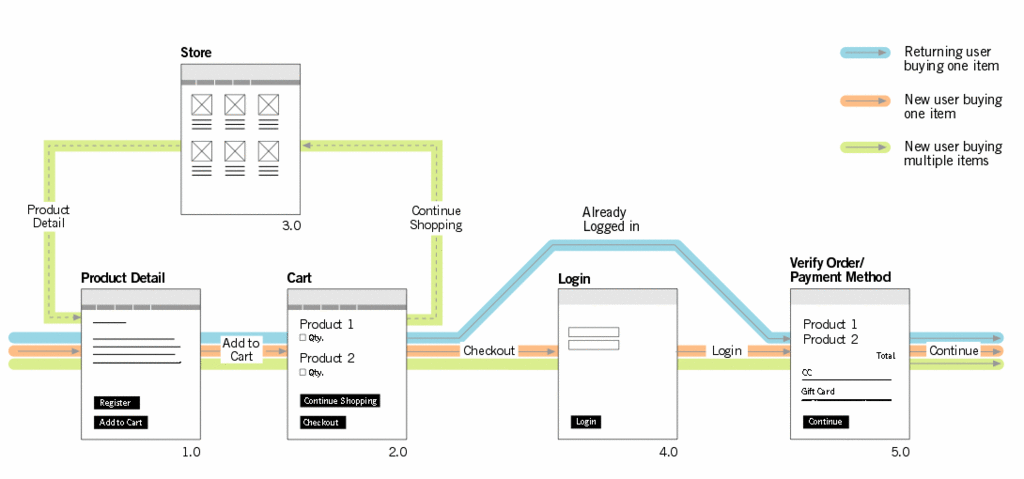
The multiple-path interaction map works like a typical subway map. Those familiar with subway maps know that they show every possible stop in a city, with color-coded routes connecting them. The multiple-path map shows every possible page a user might encounter. Each use-case is then assigned a color and its path is traced through the pages until the complete task is represented. This style of map works well to represent a small number of diverse use cases in one place.
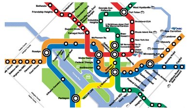
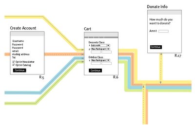 The Washington D.C. Metro map (top), and a section of a multiple path Interaction Map
Think of a single-path interaction map as a typical bus route map - each route is mapped out independently of all other routes and exists on its own page. With this method, only the screens that a specific use-case encounters are represented, and each use-case has its own map. This type of map comes in handy if there are many use-cases, or there are too many possible screens to be displayed on a single page.
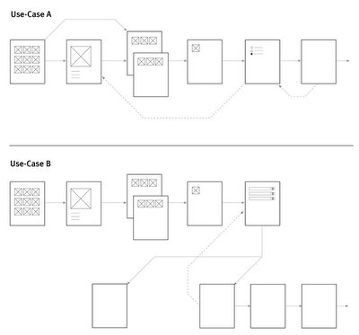 Complex processes or a large number of use-cases may require single-path interaction maps.
Interaction maps have become an indespensible tool for us at Studio UX. As we continue to refine and improve them, we'll continue to post our findings.
An interaction map should be able to answer the following questions. Will a user who comes to your site or online application be able to complete their task? What path will different users take through your site? Which use-case has the best experience and which one has the least optimal?
Remember that one of the main purposes of an interaction map is to keep the entire team, as well as the client, focused on the user's experience.
Simple is good
Each web page represented on an interaction map should only be as detailed as necessary for clarity. We’ve found that a very basic representation of the page is adequate. It is helpful to indicate any key requirement or control that may be on the page, such as a quantity control in a cart, a checkout button, or a login control. Especially important are those controls that might be up for discussion, or may affect other parts of the process. The beauty of the interaction map is that these controls are easily relocated, altered, and updated before the wireframe stage begins.
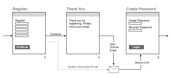 A simple login map with basic fields and buttons.
 Each page should have a title as well as a number. Pages in complex flows can have an alphanumeric indicator (for example, page 3 in the registration process could be R3). Terminology often evolves during the design of an online process, so once a number is attached to a page, it should remain throughout the duration of the project. If the page name changes, or the page is relocated, the number acts as an id tag.
Only show pages that are pertinent to the process. If the user could enter into another process, indicate that with a loop symbol and show that process in a separate map.
The path leading from each page should be labeled with the function that enabled it. For example, the cart page may have two paths leading out of it: “Checkout” and “Continue Shopping."
Try to keep the map to a page size that will be readable when printed out at common sizes – letter, legal, or tabloid size. A map that's too big to display on one of these sizes might be better off broken into smaller chunks. We usually create interaction maps in vector programs like Freehand or Illustrator, and save them as Acrobat PDFs for distribution.
Double your fun
There are two main types of interaction maps: multiple-path and single-path.
The multiple-path interaction map works like a typical subway map. Those familiar with subway maps know that they show every possible stop in a city, with color-coded routes connecting them. The multiple-path map shows every possible page a user might encounter. Each use-case is then assigned a color and its path is traced through the pages until the complete task is represented. This style of map works well to represent a small number of diverse use cases in one place.

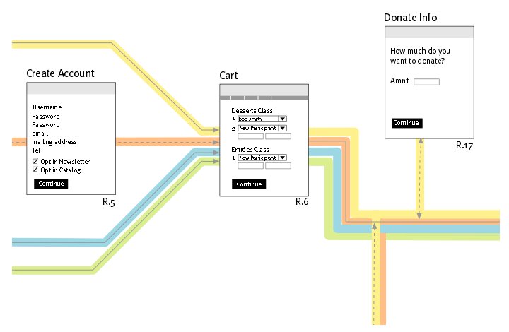 The Washington D.C. Metro map (top), and a section of a multiple path Interaction Map
Think of a single-path interaction map as a typical bus route map - each route is mapped out independently of all other routes and exists on its own page. With this method, only the screens that a specific use-case encounters are represented, and each use-case has its own map. This type of map comes in handy if there are many use-cases, or there are too many possible screens to be displayed on a single page.
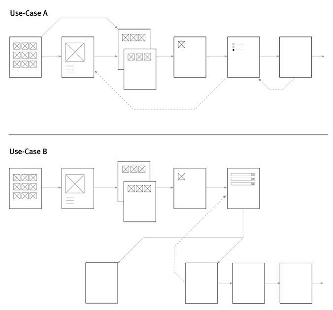 Complex processes or a large number of use-cases may require single-path interaction maps.
 Interaction maps have become an indespensible tool for us at Studio UX. As we continue to refine and improve them, we'll continue to post our findings.
posted by Paul Thackray at 3:38 PM
0 comments
![]()
![]()